
From onboarding to first book: increasing conversion by 90%
I led a design-forward redesign of Blurb’s onboarding experience to reduce friction, clarify user choice, and dramatically increase conversion to starting a book.
Before
After
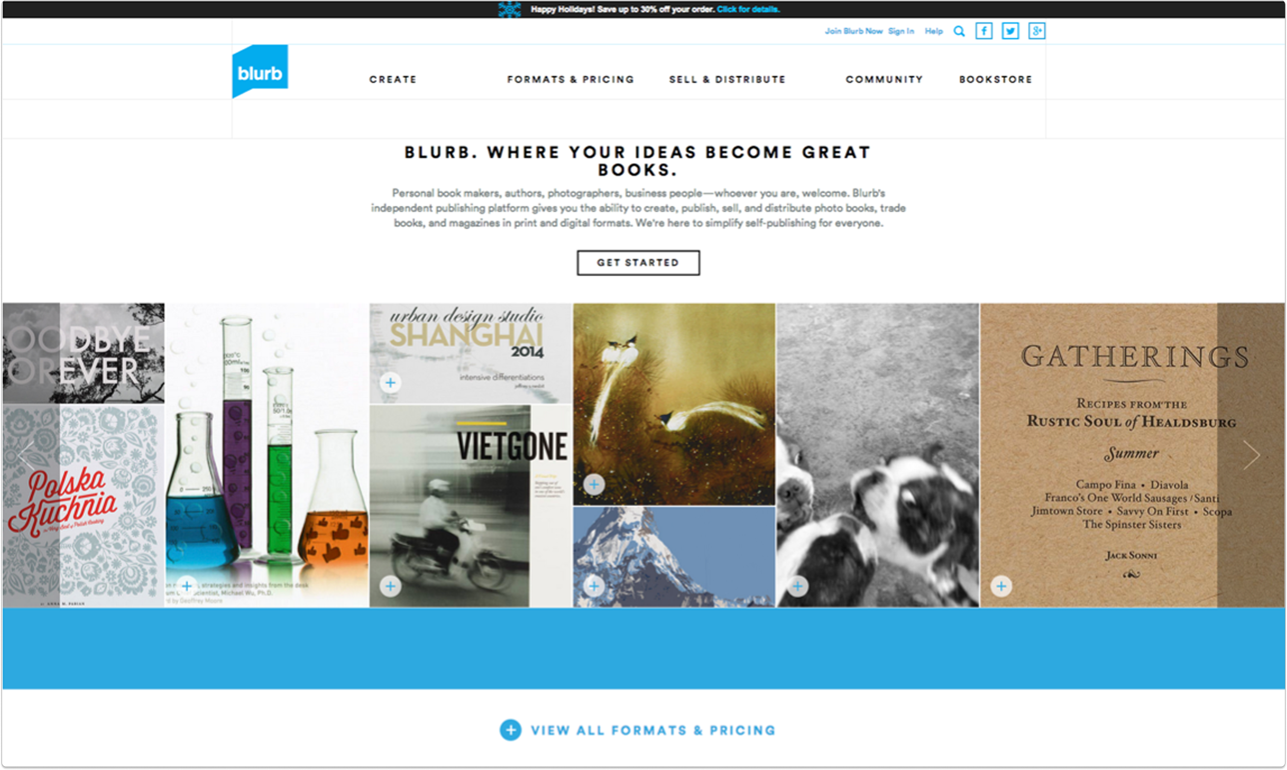
The Blurb website relaunch (done with another group) had brought with it a litany of problems, including excessive copy, confusing product information and prompting a download of software to people's desktops when they didn't expect it.
Parts of the website, such as the bookstore, had been completely overlooked.
The problem
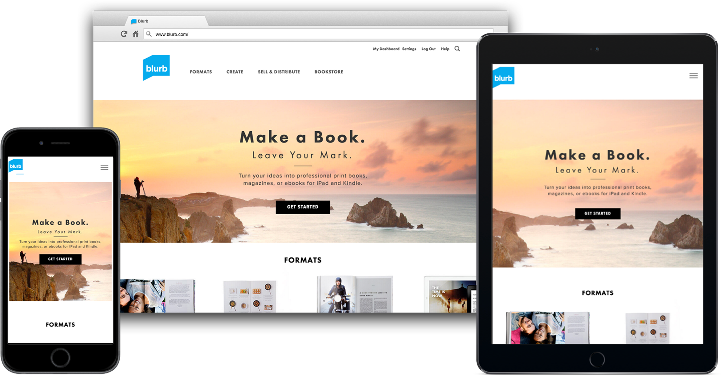
We redesigned our modules to support a new design system that was modern, responsive and beautiful.
We identified 30-40 core pages, reduced copy and conveyed our product offering more accurately.
We removed thousands of old out of date pages and redesigned the Help Center. We fundamentally changed the onboarding experience.
The solution
My role
As Director of UX, I provided a design vision and strategy for the website and managed the UX team's research and design efforts.
I worked closely with product, engineering and program management to prioritize and plan the roadmap, and championed inclusion of testing and research in our sprint cycles.
I cleared roadblocks along the way, including giving my team access to the resources they needed like research tools, design team feedback meetings, guidance and coaching.
I actively supported the growth of each team member by matching them with challenges appropriate to their skills and career goals.
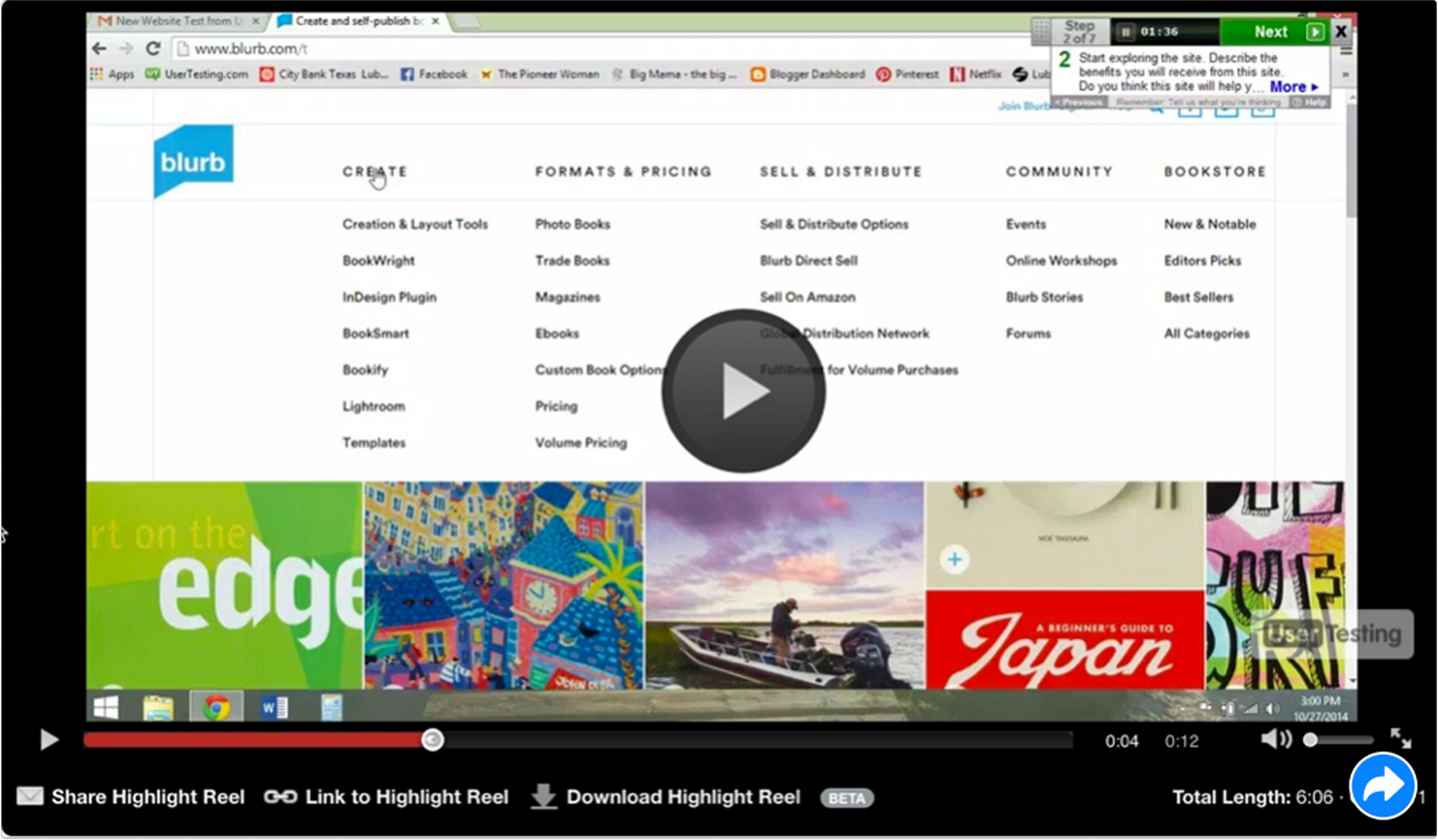
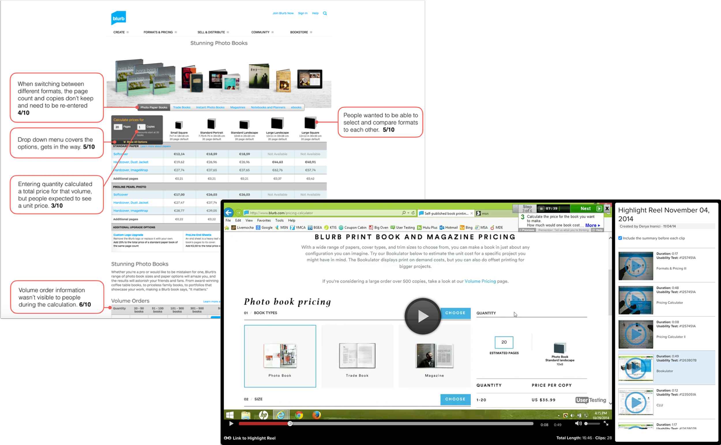
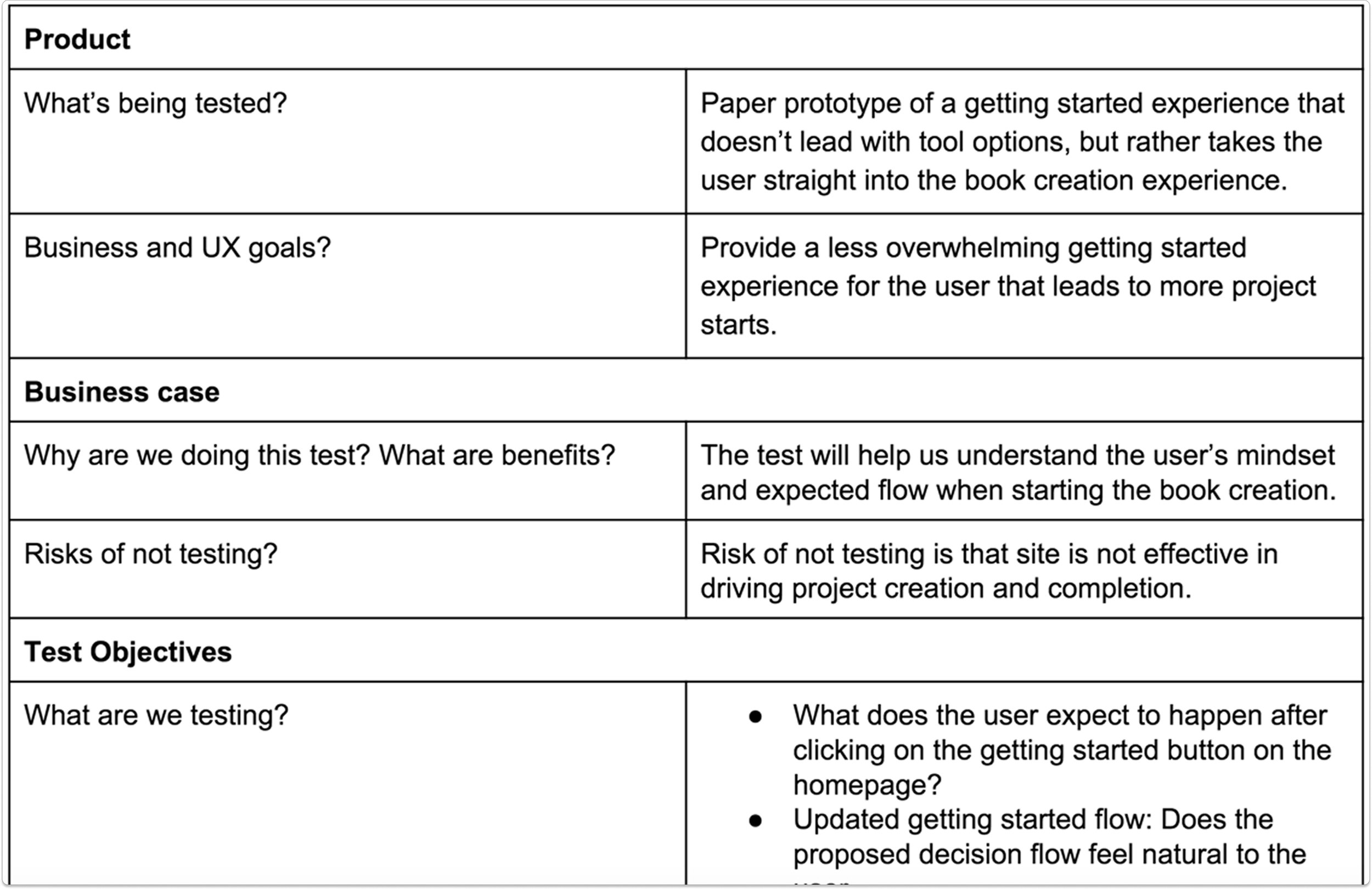
Test plan & findings
Test plan
UserTesting.com with 20+ people for specific tasks across mobile, website, tablet
Tested old site for comparison
Baseline usability testing for defining future success
Findings
People felt overwhelmed and didn't know where to start
There was a lot of reading copy for understanding; these customers would drop off in the wild
Site looks more modern than before but usability around pricing calculator, product info and navigation is poor
UserTesting.com
Planning
I ran a workshop to identify the main problems we needed to solve as part of this web redesign, then roughed out a website site map, addressing the problems we wanted to solve for along with our business goals.
Business goal: Get more people to purchase more books (print and ebooks)
Get people to make more books (and buy)
Get people to purchase published books
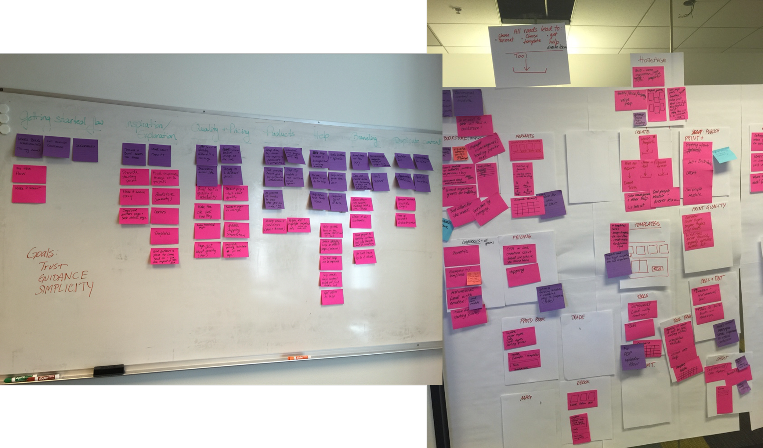
Project goals
Business metric: Increase overall % project starts per session (not downloads alone)
UX goal: Create an experience that is…
Functional: Users can complete tasks at hand with ease
Consistent: Look and feel, and navigation should match across the site
Engaging: Address user questions and move through conversion funnel
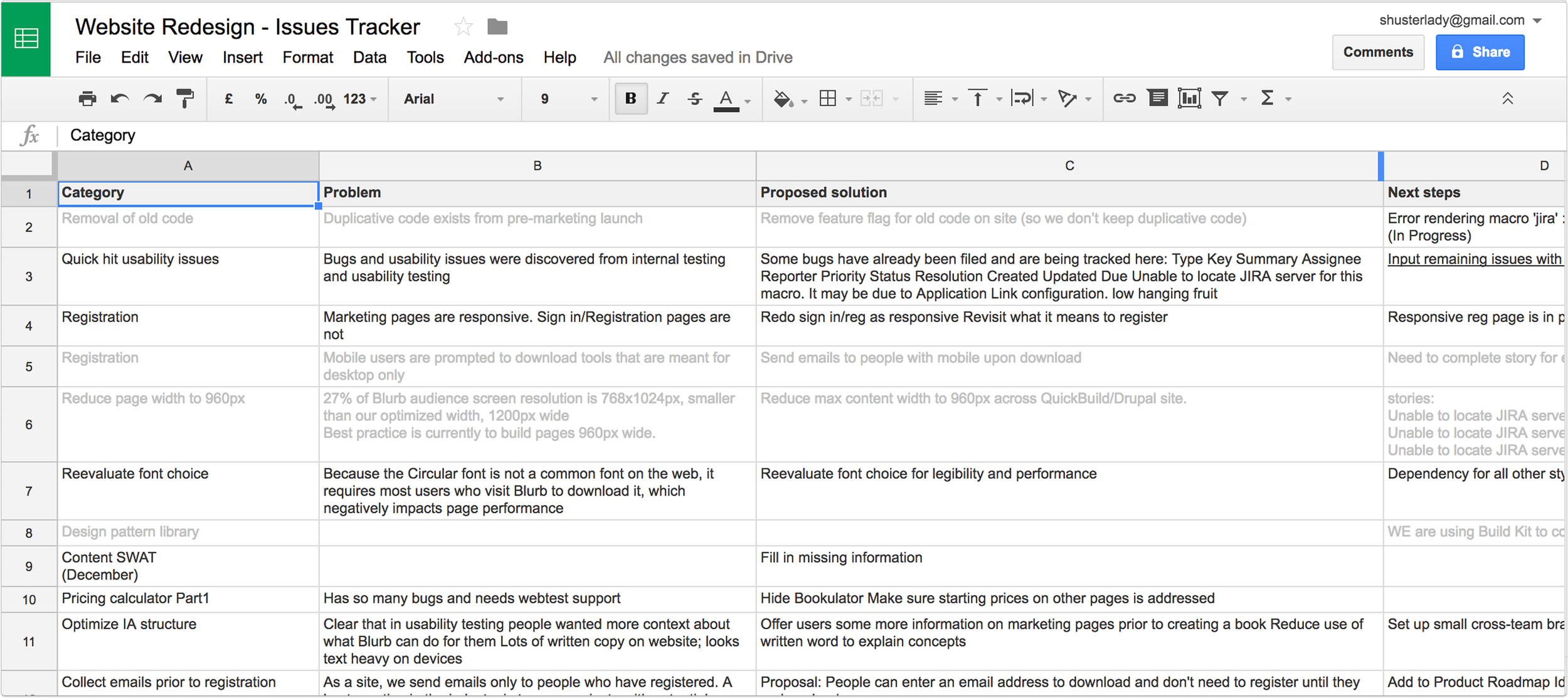
Issues tracker
A key improvement
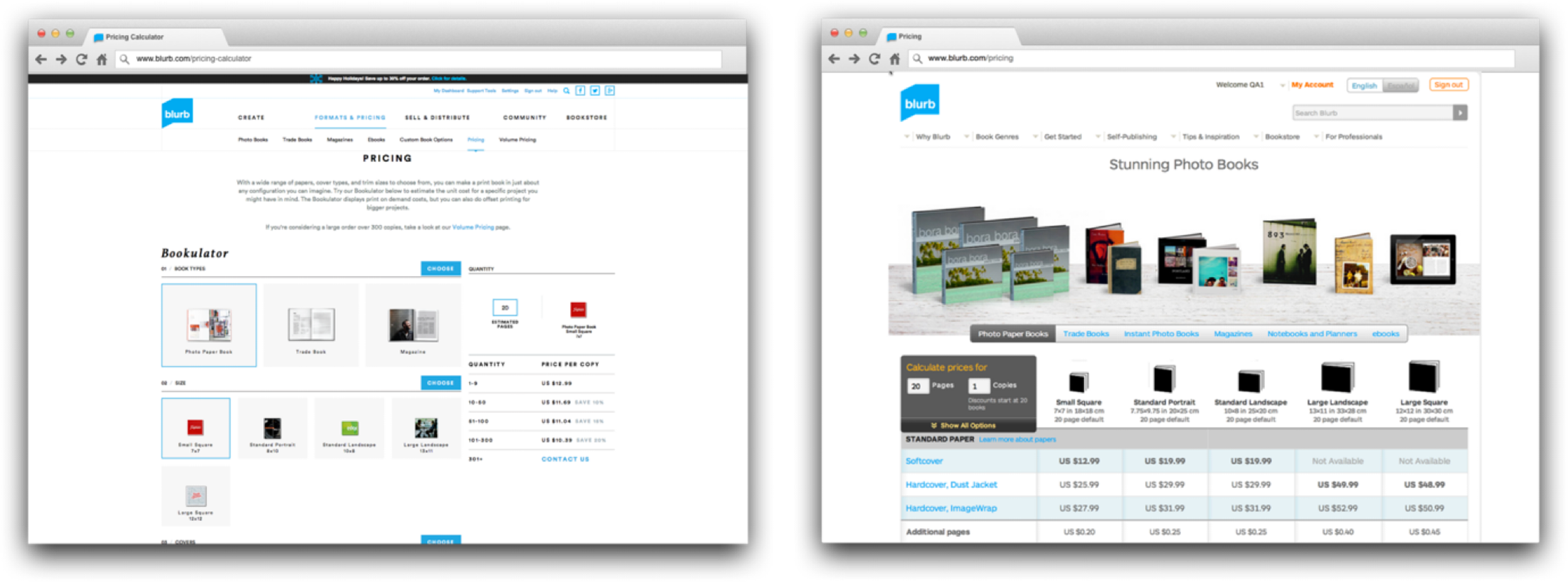
Two pricing pages are not better than one
Two pricing calculators with the same pricing information and very different designs split SEO traffic and hurt our rankings.
We collected learnings…
…to calculate both per unit and volume runs. This was the new pricing calculator we redesigned, combining the best of both worlds.
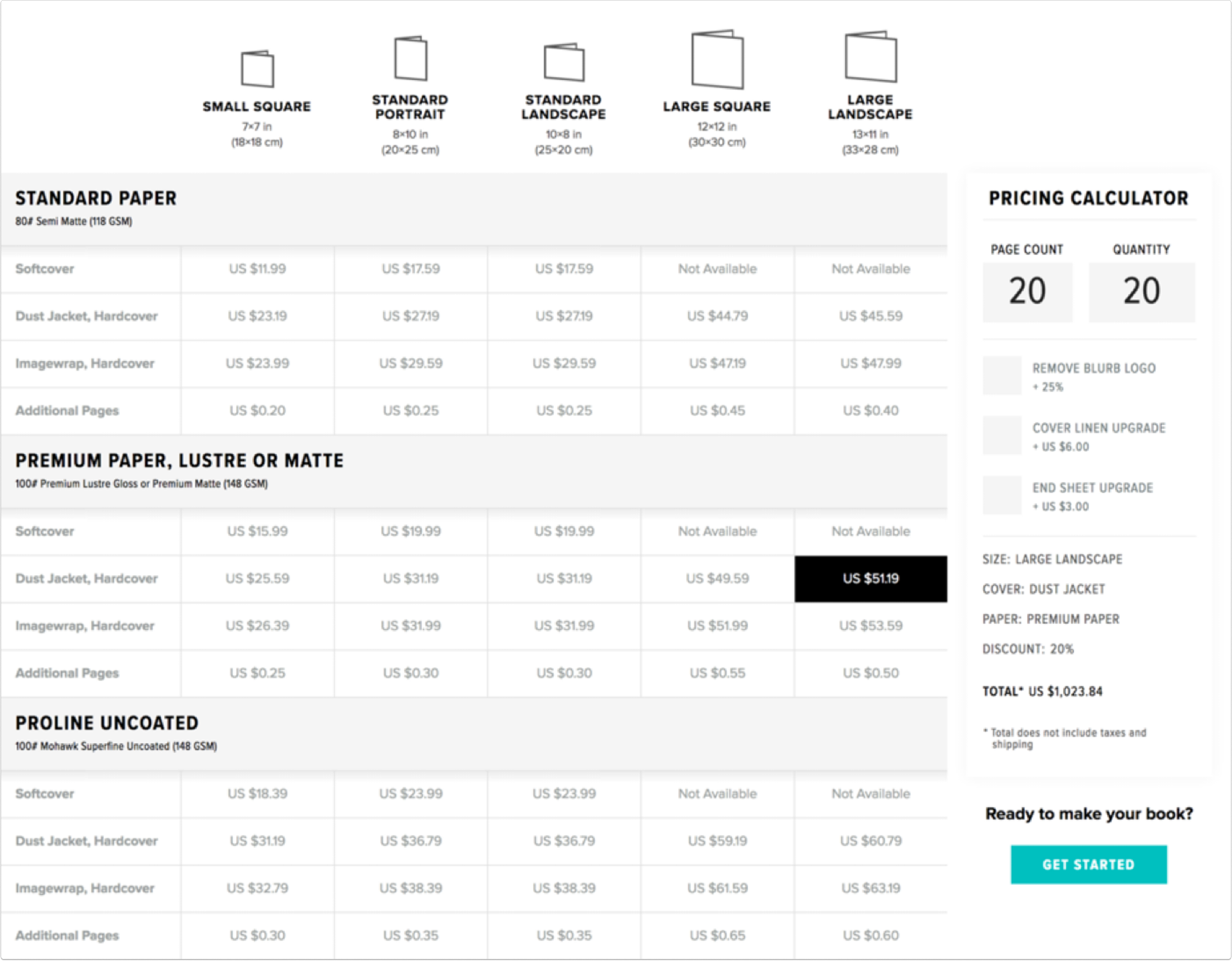
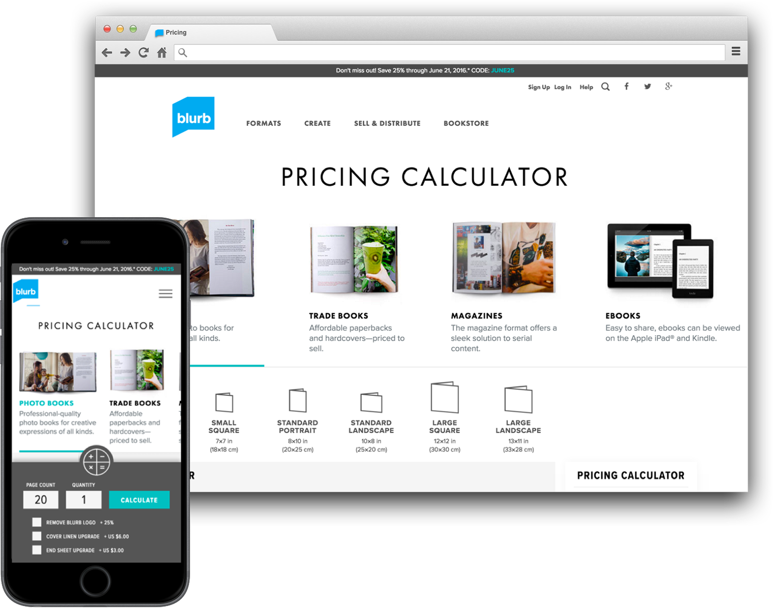
The end result was an increase in pageviews by 215%.
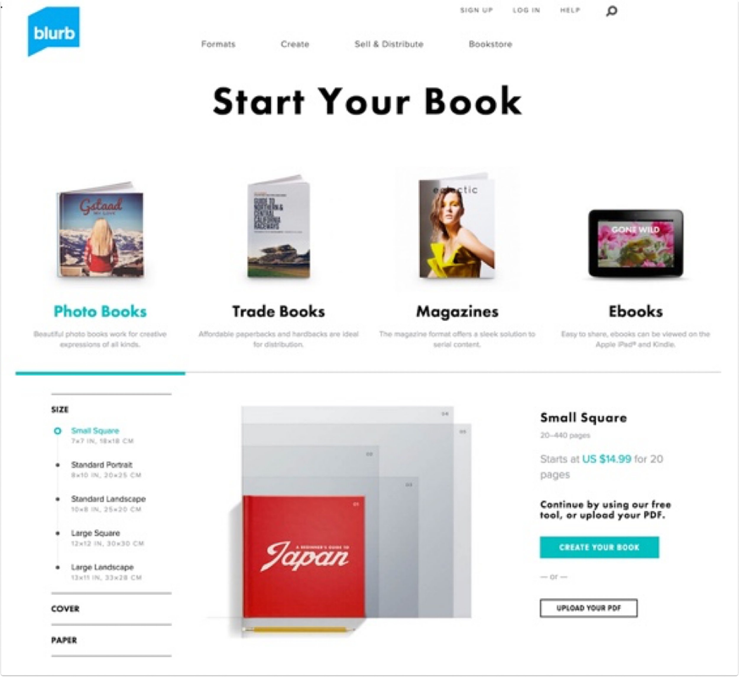
Redesign: get started page
This page was the former main entry into the get started flow. People experienced “paralysis of choice”
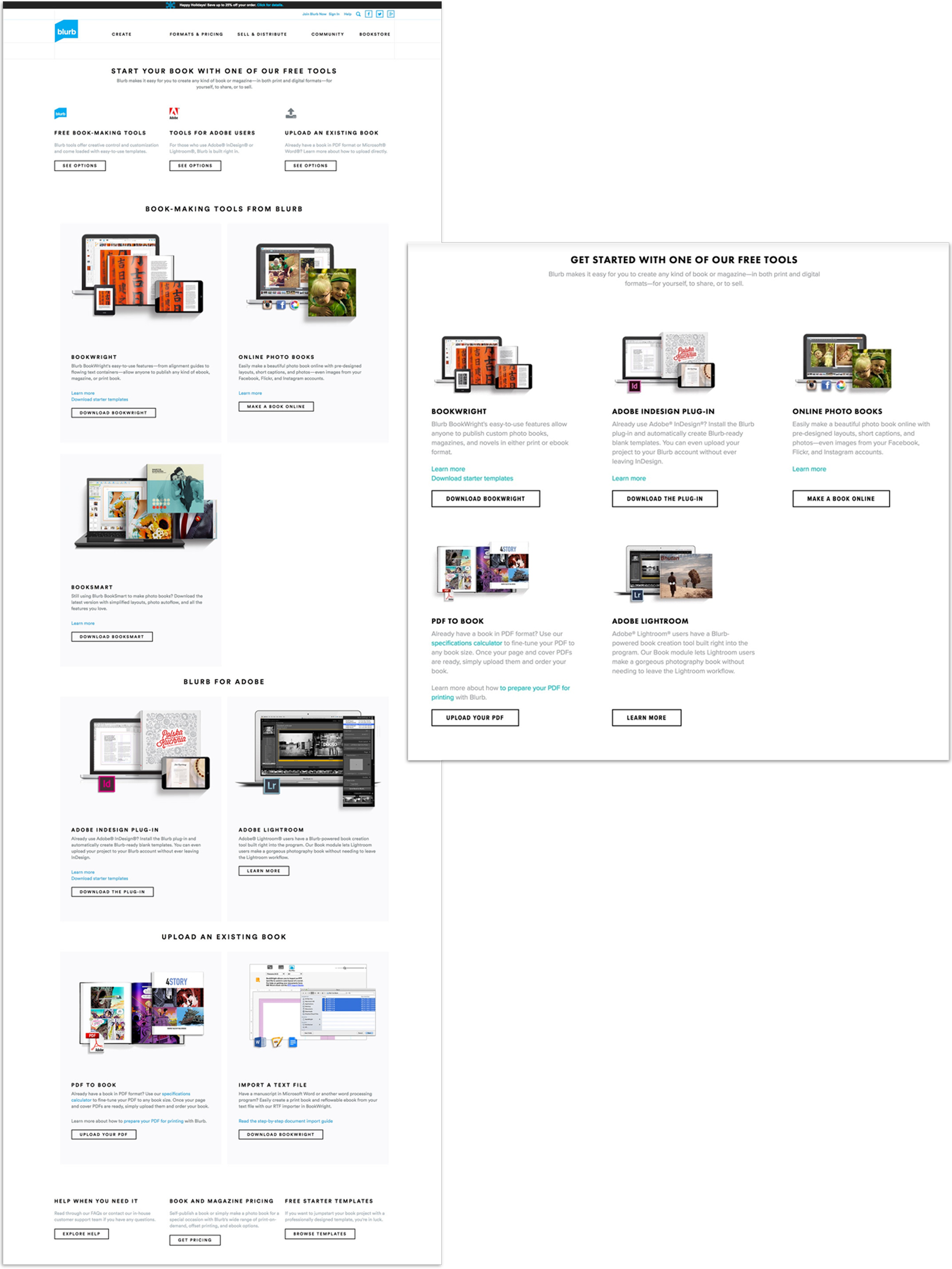
Get started page (legacy)
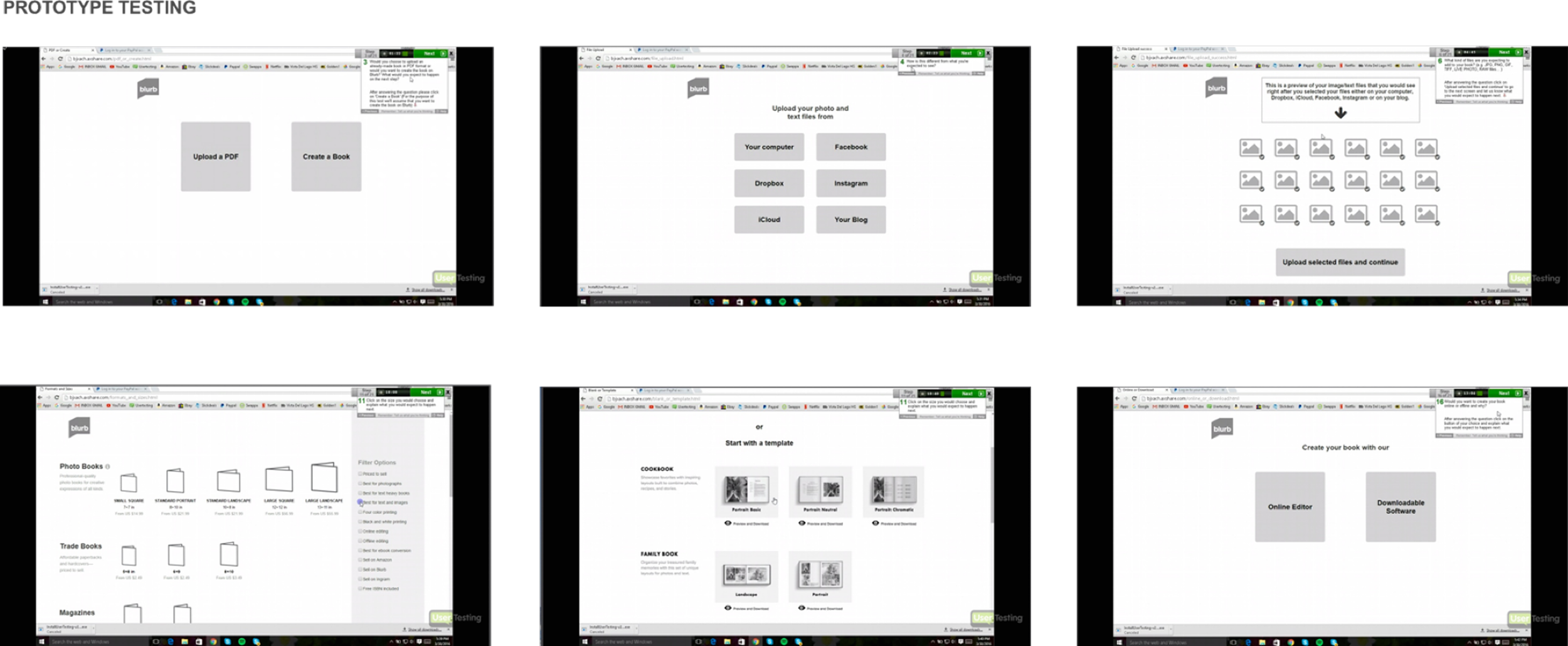
Paper prototype concept testing
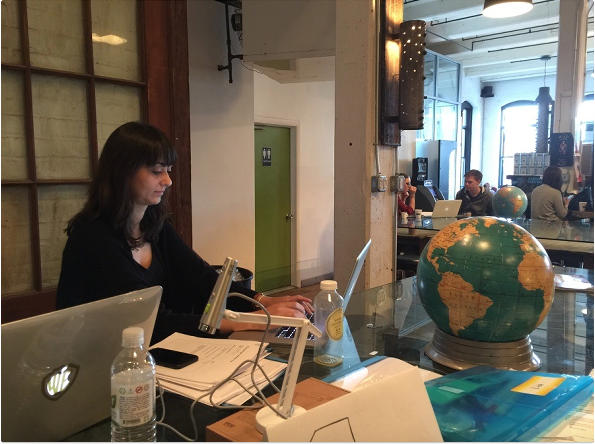
In research I noticed that people would come to the site with a specific book type in mind, usually with a size too. In one day, we created a paper prototype to test our hypothesis.
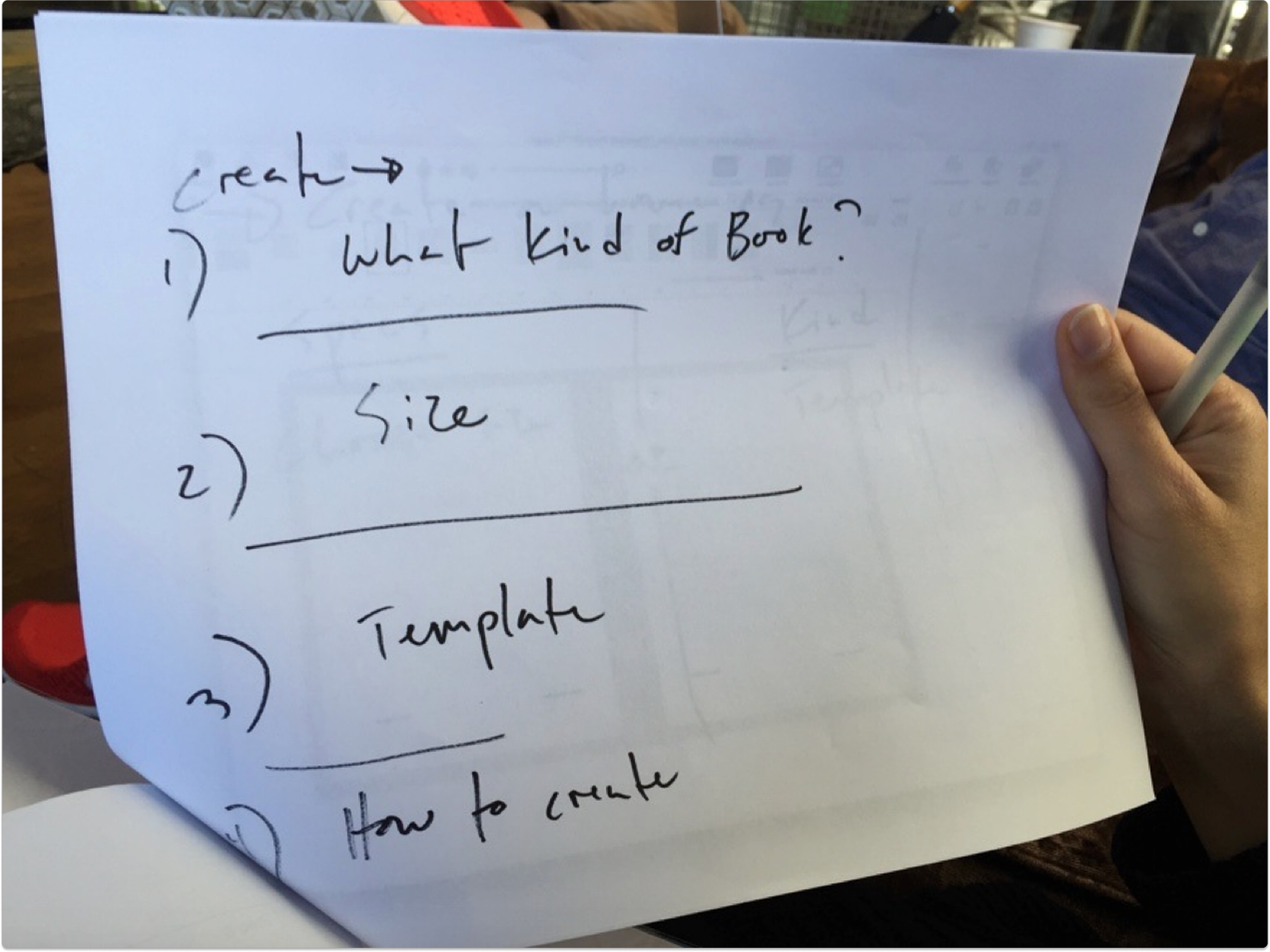
Key finding
People want to start making their book, playing around with choices and seeing something happen, rather than having to first think about the tool to use. There were too many steps.
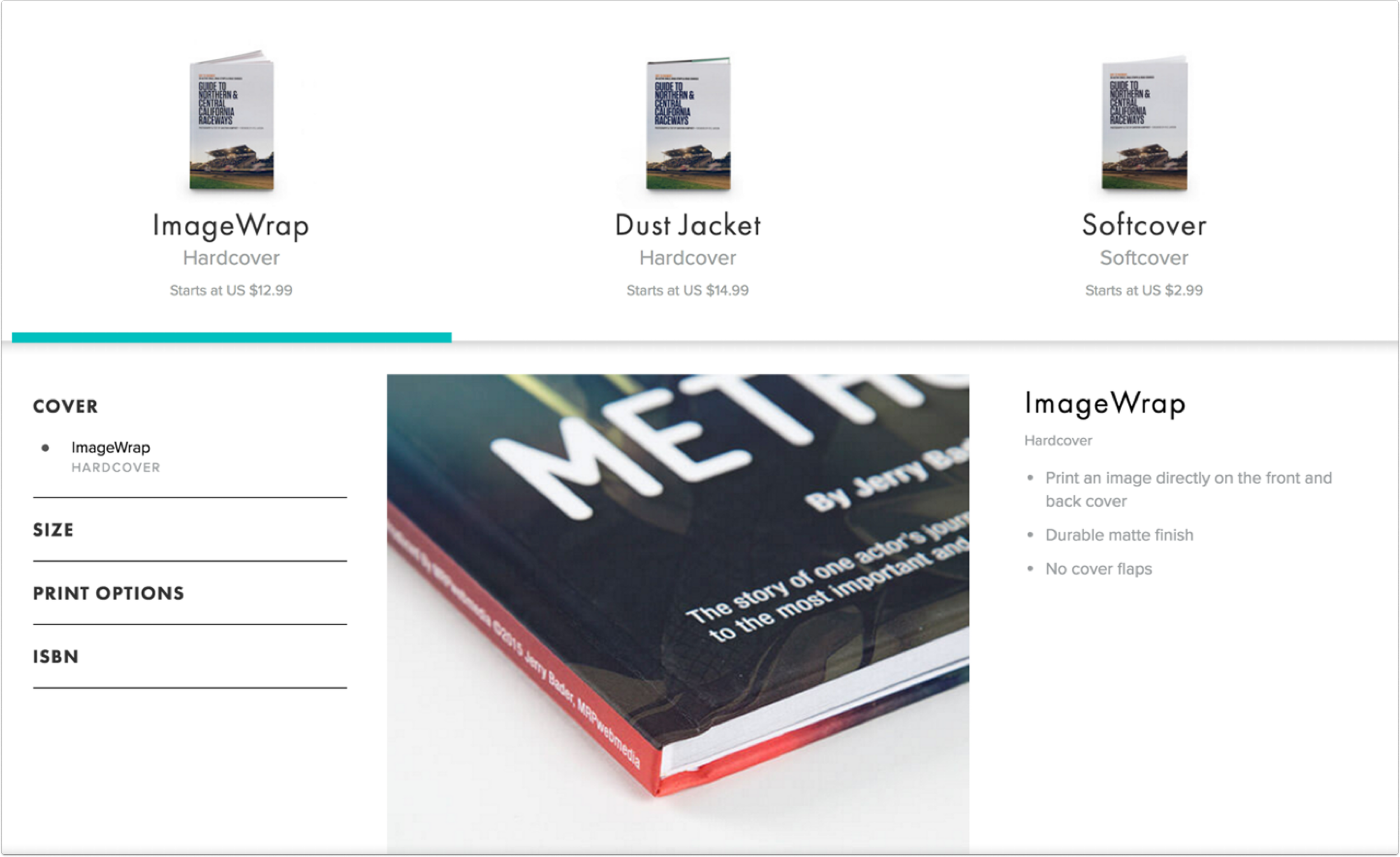
Evolving the design
It turned out that some of the elements in the flow were very similar to another module we had created for our formats pages.
The result
This new design had a 90% improvement in conversion rate (people clicking through to download or start in a tool).
This was a project where paper prototyping actually helped us hone in on what users were expecting - the speed of iteration that came with drawing and the in person communication, meeting with users in person, helped us identify what we needed to improve, quickly.
That understanding gave us the confidence to explore design ideas that were a bit untraditional.
We took concepts that were already developed and optimized them, and that made all the difference.
Reflection

Photo by Andrew Moca on Unsplash