

How we rebuilt the core admin experience for thousands of customers


Background
When I joined BigCommerce, the control panel was a daily pain point for thousands of merchants, but it had never been prioritized against feature work.
A design–engineering hackathon prototype finally caught P&E leadership’s attention, and when an engineering team became available, we had already done the legwork, so got a green light to redesign it.
My role
Drove efforts for end-to-end redesign of the BigCommerce control panel (e.g., guiding EU designers, coordinating CPX team)
Created alignment across Product, Engineering, Design and Business Development
Helped the team with role definition, design of the IA, rollout plan and retro
Set groundwork for in-product feedback modal, used to opt-out feedback collection
Directed team towards high quality execution and ran design reviews with cross functional and senior leadership to ensure visibility and buy-in
Guided stakeholder alignment with partners like TD Bank
Outcomes & impact
~50%
improvement in NPS (for usability & UI over other tracked areas)
~$Xm*
Revenue from TD Bank co-branding partnership
*private information
ISO 9001
Quality certification earned based on auditor assessment of user involvement
94%
Customers who did not opt out after trying the new experience
100%
Users who migrated to the new experience (after iterations and rollout completed)
~26%
Reduction in navigation-related support tickets

High friction problems
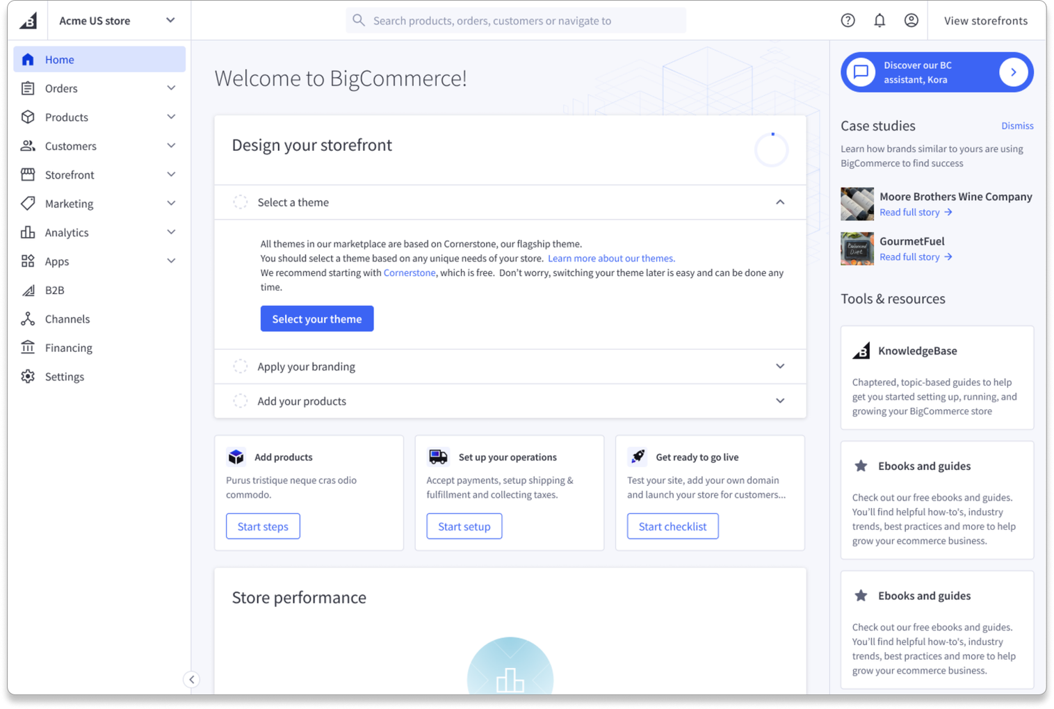
Poor wayfinding: Primary nav disappeared on deeper pages, causing users to get lost
UI felt old and untrustworthy: Merchants described the interface as “bulky” and outdated
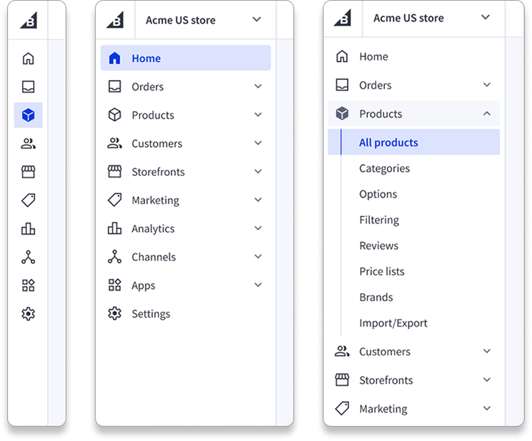
Search was hidden and unhelpful: Poor placement and limited results
Help created friction: Hard to find, opened in-line and blocked navigation
No ownership: Core utilities had no team steward, leading to fragmented, inconsistent UX over time
Proactively drove a vision
Control panel redesign had not been prioritized, despite clear UX issues and no team owning it
As a design team we took the opportunity to prototype a new navigation concept in a hackathon - it captivated our VP of Engineering, who wanted to build it.
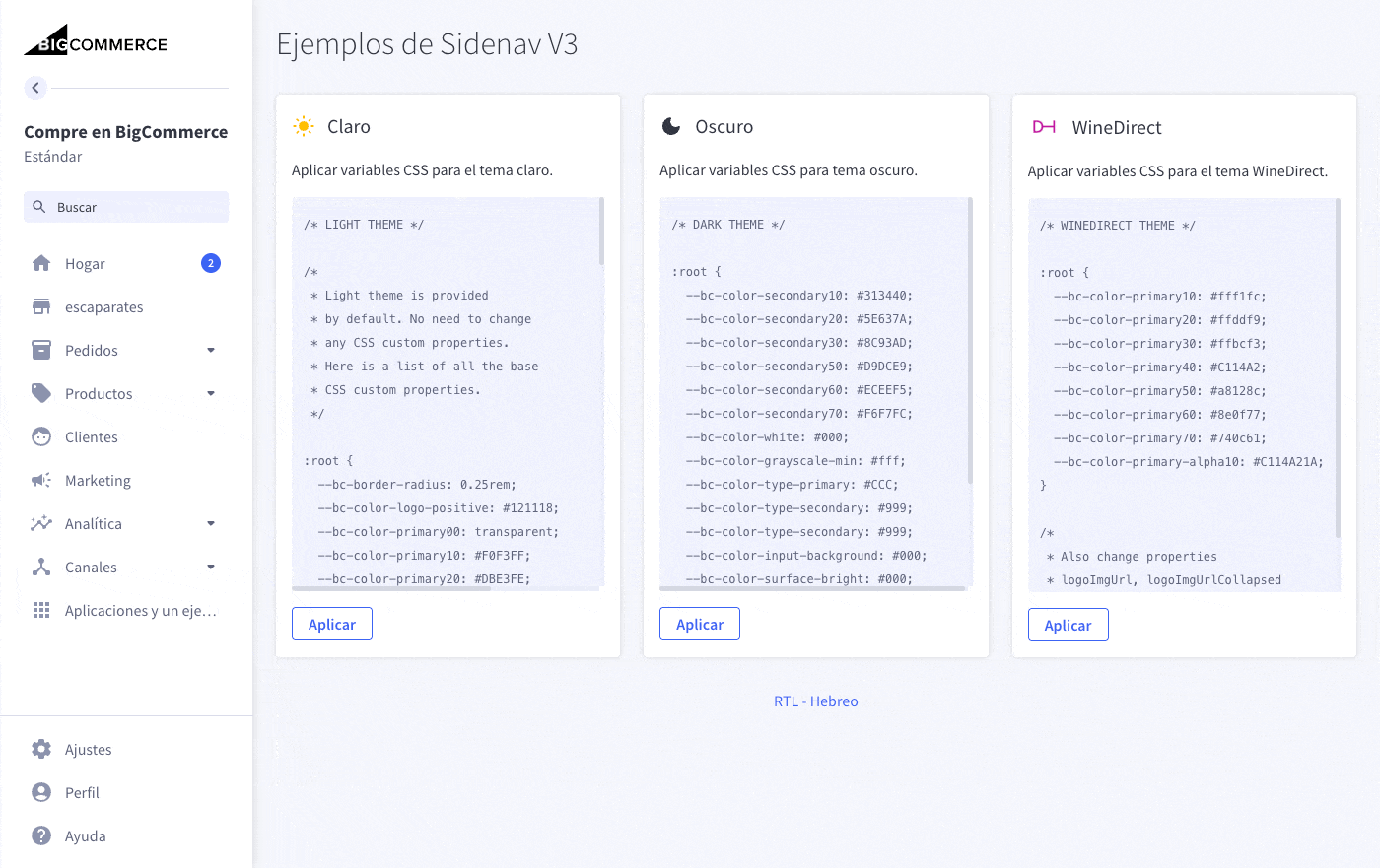
I encouraged my team to build a coded, extensible vision prototype (white-labeling, themes, RTL) and used this to secure leadership support for the redesign.

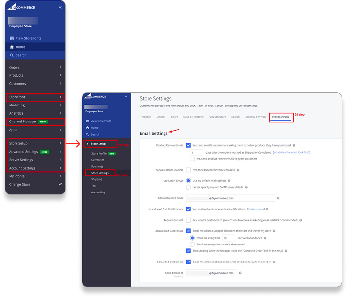
Redesign of settings IA
Prioritizing immediate IA pain
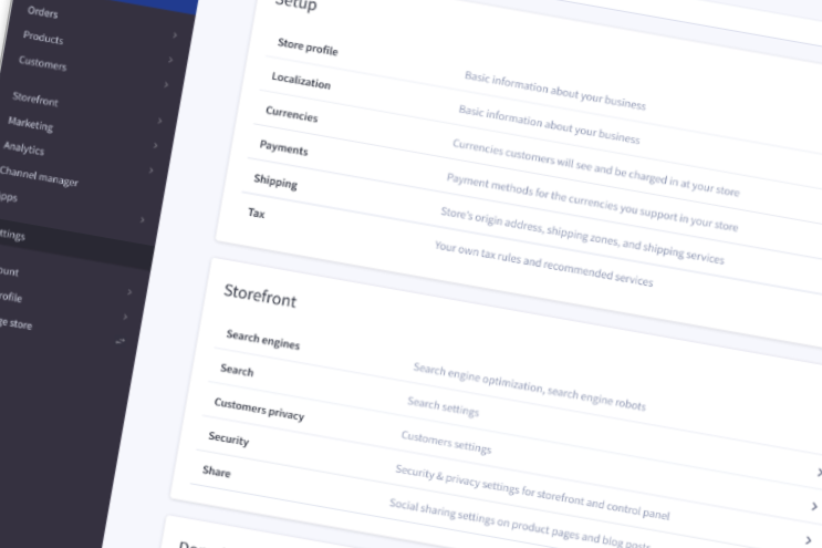
Merchants were confused by six different “settings/store/storefront” sections with overlapping labels and no clear structure.
User interviews and card sorting showed that people naturally grouped settings into a few clear categories—far simpler than our existing IA.
Consolidated everything into a single, categorized Settings page with clearer labels and search, removing major friction and setting the stage for the broader redesign.

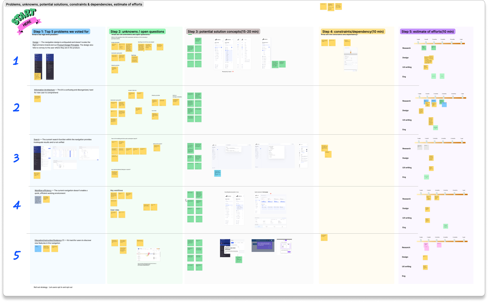
Team is staffed - let’s kick it off!
I partnered with a PM Director to form the CPX team, then ran workshops to align Engineering around user pain points and establish a clear rollout strategy.
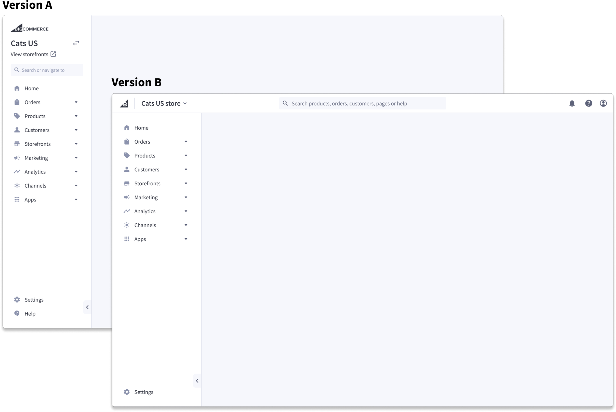
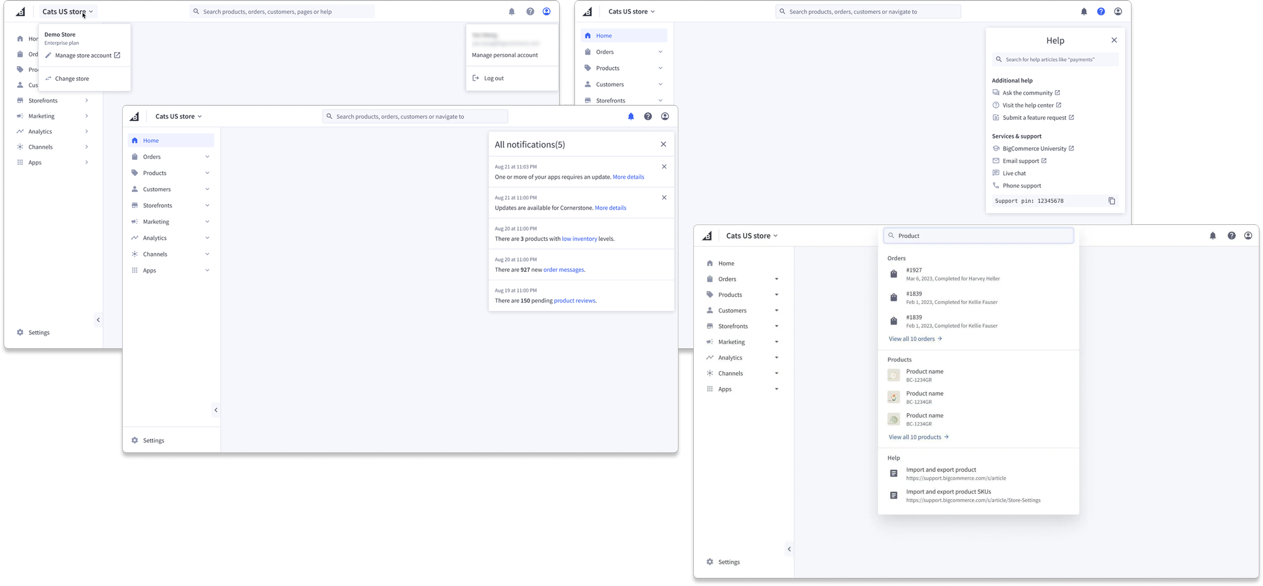
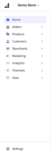
Two competing designs
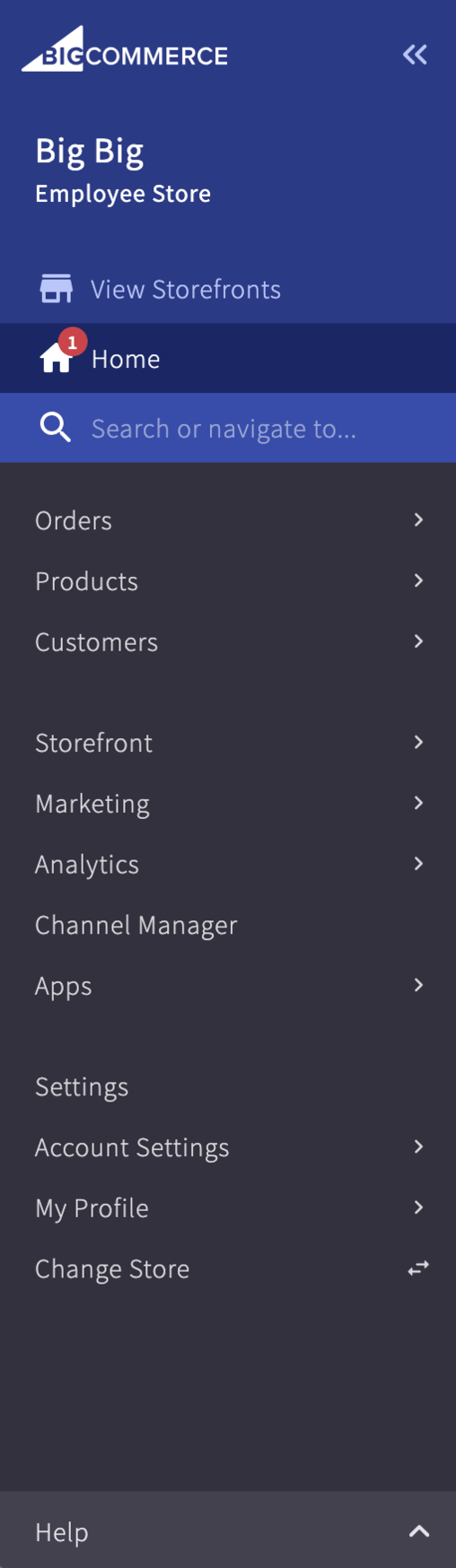
Core tasks (like Orders) and utilities (like Search and Help) were mixed together in the same nav space, creating confusion and poor wayfinding.
Usability tests showed that users understood the experience far better when utilities were separated from core navigation categories.
Built two coded prototypes—with and without a top bar—and tested them over three weeks. Version B, which split utilities into a top bar, clearly won for clarity and ease of navigation.
“This navigation makes a whole lot more sense… things that relate to the store are separate from user settings.”
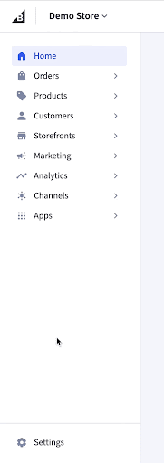
Layout & interactions finalized
We refined the nav so chevrons opened sections and labels took users directly to pages.
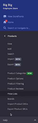
Utilities like search, help, notifications, and store management were separated into clear dropdowns with familiar enterprise interaction patterns.

Visual polish & build
The Control Panel’s visual design felt dated, and new iconography raised concerns about consistency across teams.
Elevating visual polish required both stronger iconography and clear alignment between Design and Engineering on system standards.
Refreshed the top-level nav with clean, Material-inspired icons, facilitated alignment between teams, and updated the design system to support the new components—resulting in a scalable, consistent, and more polished UI.
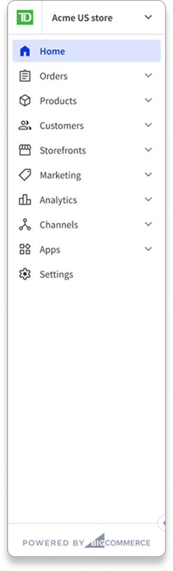
Navigating partner requirements
TD Bank depended on a co-branded version of the old Control Panel, making the redesign a high-risk transition for a key partner.
Proactive communication and tailoring the experience for white-label needs would turn a potential friction point into alignment.
I partnered with BizDev and Product to update documentation, align on timelines, and refine the UI for white-label support—ultimately securing TD Bank’s full enthusiasm for the new design.
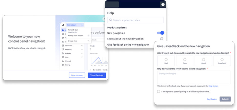
Getting to 100% adoption
We needed a full, frictionless migration—no users left on the old design.
Transparent communication and a safe, temporary escape hatch built trust and give us real-time feedback to improve rapidly.
Rolled out a guided tour, added a short-term opt-out with feedback, and iterated fast to ensure a seamless full transition.

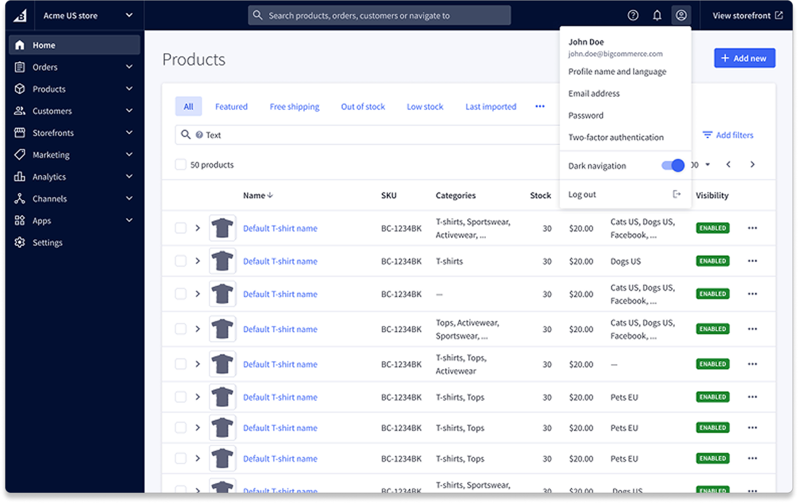
They wanted it darker
Users wanted dark mode, but our legacy system couldn’t support a full dark theme.
A lightweight, high-impact improvement could both validate the redesign direction and show customers we were listening.
Shipped a nav-only dark mode, tested color options with customers, and added a simple toggle—creating a win that built trust and momentum for the redesign, and for BigCommerce.
Reflections & learnings
This project showed me the power of illustrating a vision early—even when it’s not on the roadmap. The launch became our model for high-quality releases, helped secure ISO 9001 approval, and strengthened trust in design’s ability to deliver thoughtful, user-centered solutions at scale.
The Control panel redesign demonstrated that we could apply user-centered processes to deliver high quality, high-impact solutions.
To share what made it successful, I ran a retro with the core team and wrote an internal blog post to share these learnings with the wider org:
7 principles for quality releases:
Lead with user insight
Plan intentionally & engineer for scale
Use/evolve design standards
Dogfood early & often
Collaborate deeply
Test continuously
Iterate fast after launch
